

Smart Interface Design
Pattern Workshop
An online weekly workshop held from September - October 2023 by Smashing Magazine. On this workshops, I had a chance to refresh, expose and learn UX knowledge from the mentor, classmates, and assignments based on mentor’s real life projects. The assignments were designed focusing in solving / improving some parts of each projects.
My role
Workshop participant
Mentor
Vitaly Friedman
Assignments
1. EU parliament
2. Finviz
Workshop length
4 weeks
Organization
Smashing Magazine
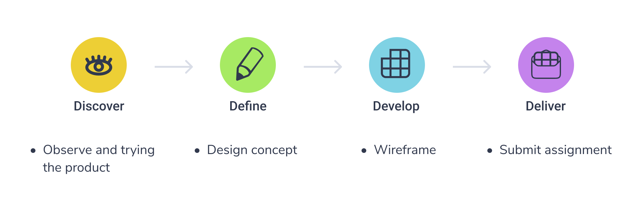
Assignment 1

“ Better search experience concept.
Respect constraints and design KPIs”
Focus
Search & Navigation
Project
EU Parliament Website
Client’s insights & constraints
EUR-LEX, the main EU Law repository with access to EU legal documents, available in all 24 EU’s official languages and updated daily.
The most used filters are: Collection (always used), Document reference (sometimes used), Date (often used), and, of course, a text box for search.
Many internal users of the European Parliament’s websites are expert users. Mainly exploring European Union laws, regulations, or tracking the status of legislative proposals and elements.
My Process
I observe the parliament web page consists of three pages:
* Landing page (right),
* Search result page (bottom left),
* Advance search page (bottom right).
These pages share similar purpose yet looks entirely different.


My concept
Reduce task completion time

Replace the original advance search function to filter function that works to support users search item.
Move the standalone advance search page to the left side of web page as a filter function
Reduce brain overload

Combine the three pages layout into one
Made the majority functions visible in one glance

Assignment 2
“ Increase the number of paying customer from “FREE” to “ELITE” by half the transition time (from 42 days to 21 days)”
“Focus on the Screener page”
Focus
Filters & Table
Project
Finviz
Client’s insights & constraints
Finviz ultimate goals is to sell more “Elite” tiers to customers also improving the UX.
Finviz’s users goal is to compare data. They are majority above 30, highly trained and specialized in trading, and managing portfolio.
“Free” plan users complain about the site experiences, such as speed of the interaction on the site, finding the right buttons and features on the site.
New users find the interface very complex and difficult to use and understand.
Users requested some features, like : better ways to save presets, import portfolios, manage filter fasters, (available on Elite plans) custom alerts.
Most “Elite” users are very satisfied with the features it has, but they are also fine with the “free” plan for while.

Screener tab on "Free" plan

Screener tab with drop down filter options on "Free" plan

"Elite" section on "Free" plan
My Process
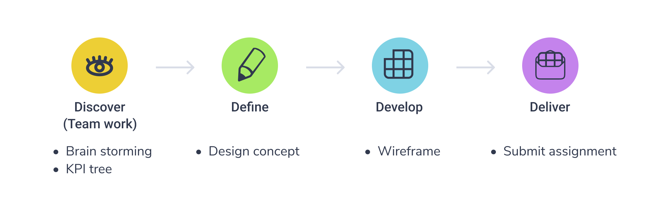
Brainstorm & KPI Tree
Together with Shahneela Shaukat, Nicky Dyer, Jeremy Manoto, and Claudine Rodriguez, as a group we start-off the projects with brainstorming ideas on what make users convert to elite quicker.
Our ideas falls into improving / organizing the UI, educate users about the app and finance, and introduce “Elite” existence to present “Free” user indirectly.

We took ideas from Major Project and Quick wins and sorts them into groups that answer users struggle and eventually lead to client’s goal.

My concept
Make it clearer which section is controlled by which buttons.
Filter is not expanded from at the beginning.
Organize UIs

“Elite” is full version of the “Free” plan. Indirectly introduce to users

Making user aware of Elite through Free plan.
Make the “Elite” subscription appealing

Early bird subscriber, trial version.
